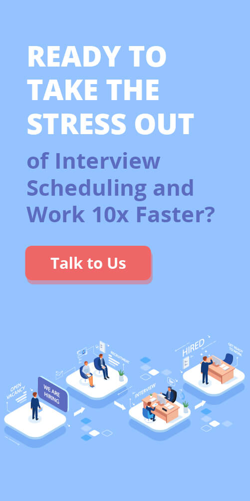
Your career site is one of the most important performance channels in your talent strategy. For many candidates, it’s the first real touchpoint with your organization, and where you can start influencing talent’s decision to hit “Apply” or click away.
When qualified talent has more options than ever, career pages need to function like finely tuned marketing funnels. That means applying the same rigor: data, analytics, and optimization – that your marketing team uses to drive customer conversions. The payoff? Stronger recruiting outcomes.
Research from Phenom, a talent intelligence platform, shows that career sites are often the hub that connects employer branding and social media efforts, both critical drivers of applicant engagement. In fact, most Fortune 500 companies rely on multiple job platforms and social channels, using their career site as the central point where candidates discover and engage with their brand.
In this guide, we’ll explore how to design a career page that doesn’t just look polished; it actually performs: attract, engage, and convert the right talent at scale with visuals from the Rakuna Landing Page and Johnson Controls’s career page – a world leader in smart buildings technology.
Mobile-First Optimization and Fast Performance
Always assume candidates will visit on their phones.
Glassdoor research found that 58% of Glassdoor users find jobs through smartphones to search for employment, and 35 per cent prefer to apply via mobile devices.
Slow-loading or non-responsive pages are one of the fastest ways to lose a candidate’s attention. Research from Google highlights that more than half of users abandon a site if it takes longer than three seconds to load (Shellhammer, 2017). For recruiters, that means even the strongest employer brand messaging won’t matter if your career site isn’t fast and responsive.
Core Guidelines to Drive Engagement and Sign-Ups
Responsive Mobile-First Design

Think about how most people search for jobs today: it’s often on their phone, in between meetings, on the commute, or even while sitting on the couch at home. If your career page doesn’t work smoothly on a mobile device, you’re instantly creating friction that drives candidates away. That’s why a mobile-first design should always be one of the top optimization goals for your Career Page.
What does that mean in practice?
- Design for the smallest screen first. Start by imagining how the page should look and function on a smartphone, then scale it up for tablets and desktops. This ensures that critical elements – like the “Apply” button or job search bar – are always visible and easy to use, no matter the device.
- Make navigation effortless. Replace complex menus with simple, collapsible options. Candidates should be able to get from the homepage to a job application in just a few taps. Large, finger-friendly buttons (“tap targets”) prevent frustration and misclicks.
- Keep content concise and scannable. On a phone screen, long paragraphs can feel overwhelming. Break information into short, skimmable sections, and use vertical scrolling instead of cluttered layouts. Think “quick read,” not “wall of text.”
- Test, don’t assume. A page that looks fine on your desktop might be clunky on mobile. Regularly test new layouts, images, or forms using browser mobile view tools, or better yet, pull out your own phone and navigate the page like a candidate would. Catching issues early ensures every visitor has a smooth experience.
By prioritizing mobile usability, you directly impact key recruiting metrics: fewer candidates will bounce due to frustration, more will complete applications, and your talent pool will expand.
In short, a career site that feels effortless on mobile keeps qualified talent engaged right where they’re most active.
Prioritize Page Speed

Fast-loading pages are critical – In Google’s own words:
Over 50% of visitors bounce if loading exceeds 3 seconds.
Compress images, enable lazy loading, minimize scripts, and reduce external requests to speed up performance. Remember, no matter how great your content, slow pages drive candidates away.
So, how can you make sure your career page loads quickly?
- Compress images. Large, high-resolution photos look great, but they can slow your page down. Use tools like TinyPNG or ImageOptim to reduce file size without sacrificing quality.
- Enable “lazy loading.” This simply means that images or videos don’t all load at once. Instead, they load only when the candidate scrolls to them. For example, if your job listings sit at the bottom of the page, the images above won’t slow things down for candidates who just want to get straight to the openings.
- Minimize scripts and plugins. Each extra tracking script, widget, or external plugin adds “weight” to your page. Audit what’s truly necessary and cut anything that doesn’t directly support the candidate experience.
- Reduce external requests. The more your page relies on pulling content from outside sources (like fonts or embedded widgets), the longer it can take to display. Hosting critical files locally often speeds things up.
💡You can use PageSpeed Insight (pictured above) to test how fast your mobile app is running and loading elements, and discover new improvement opportunities.
Simple, Clean Navigation & Readability
When candidates land on your career page from a phone, the last thing they want is to dig through a maze of menus or endless blocks of text. A clean, minimalist design not only looks professional but also helps visitors quickly find what they need. Whether that’s searching for jobs, signing up for updates, or learning about your company.
- Streamline your menus. Keep only the essential paths visible: “Search Jobs,” “Sign Up,” and “About Us/Company Info.” Anything else can feel overwhelming on a small screen and risks driving candidates away.
- Break content into skimmable sections. Use clear headings, plenty of whitespace, and short paragraphs. On mobile devices, walls of text can feel like heavy lifting, but bite-sized sections make information easier to digest.
- Design with intent. Photos, graphics, and videos should always serve a purpose: showcasing culture, explaining a process, or guiding candidates toward the “Apply” button. If a visual doesn’t add value, it’s just clutter.
Think of your career page like a store window: you want it to be attractive and informative, but not so busy that people walk by without noticing the most important items.
Additional Must-Do Tips to Maximize Talent Attraction
Include Mobile-Friendly Multimedia
Short, compressed videos and employee testimonials can transform a static page into a dynamic experience. On mobile, attention spans are limited – so think in bite-sized clips that load quickly and highlight your culture or employee success stories.
Siemens, a German multinational technology conglomerate, observed candidates spending 4 minutes longer on job postings with video, doubling engagement metrics like time on page and open rates. Candidates who watched the video spent on average 8:40 minutes versus 4:40 without videos,
Leverage Push Notifications and Chatbots

Candidates want answers on their own time, not just during office hours. Embedding chatbots or AI-powered assistants (optimized for mobile) provides instant responses to FAQs about roles, benefits, or the hiring process. Adding opt-in push notifications for job alerts or application status updates can keep your brand top of mind, reducing drop-offs and encouraging repeat visits.
Implement Location and Device Optimization

Relevance drives action. Geotargeting allows you to serve localized job listings or highlight remote options based on where a candidate is browsing from. Ensuring that your career page is optimized across both iOS and Android platforms also guarantees a consistent experience, no matter the device.
Monitor Mobile Analytics Closely

Mobile visitors behave differently from desktop users. Tracking mobile-specific analytics, such as bounce rates, session duration, CTA clicks, and application drop-off points, gives you a clearer picture of where candidates might be getting stuck. These insights allow you to make data-driven changes that directly improve conversion rates.
💡You can start monitoring your mobile site using Clarity (pictured) – brought to you free of charge by Microsoft!
Test Across Devices and Networks

Not all candidates have the latest smartphone or access to high-speed Wi-Fi. Testing your career page on a range of devices, screen sizes, and even slower connection speeds ensures that every applicant has a smooth experience. A career site that only works perfectly on a flagship device misses out on a significant share of potential talent.
👉 Want more tips on building a mobile-first career page?
Check out how the Rakuna Team, one of the best mobile recruiting software providers, breaks it down step by step.
Make Jobs Easy to Find
Candidates come to your career site to find jobs – make that process frictionless. Confusing layout or hard-to-find openings will send them elsewhere. Organize and highlight your roles:
Prominently display openings
The number one reason candidates land on your career page is to see available roles. If they can’t find them right away, they’ll leave, and you lose a potential applicant. That’s why it’s critical to feature live job listings directly on the main career page, not hidden behind multiple clicks. When openings are easy to spot from the start, you capture interest immediately and reduce bounce rates.
Implement robust search and filters

Candidates expect the same ease of use on your career page that they experience on consumer platforms. A simple search bar paired with intuitive filters: by location, department, or job type, can dramatically reduce frustration and time-to-apply. Think of filters like “Engineering,” “Remote,” or “Internship” as shortcuts that let candidates zero in on what matters most to them.
Taking it a step further, advanced search functionality makes a big difference. Features like sidebars with multiple filter options, or smart keyword recognition (e.g., treating “QA” as “Quality Assurance”), prevent candidates from hitting dead ends. The smoother the search experience, the higher your chances of keeping qualified talent engaged long enough to click “Apply.”
Use clear calls-to-search

Place the search box or “Browse Jobs” button above the fold on all pages so candidates never have to hunt for it. A sticky header with a job-search field can further reduce drop-offs.
Group and label roles logically.

Large enterprises often post hundreds of openings at once. Organizing jobs into categories like “Engineering,” “Marketing,” or “Remote” helps candidates scan quickly. You can even highlight “high priority” or “hot” jobs at the top to guide attention where you need it most.
An intuitive job search/navigation directly boosts conversion: the easier it is to find and apply to a role, the more candidates will click “Apply”. (Conversely, hidden or outdated listings drive up bounce rate.)
Simplify the Application Process

Every extra field or confusing step in your form costs candidates. Long or complex applications are conversion killers.
A recent LiveCareer report from August 2025 found that 57% of 517 U.S.-based job seekers have abandoned an application in the middle of the process due to it being overly complicated or long.
To improve the completion rate of your “Apply” funnel, streamline each part:
Ask only for essentials upfront

Omit or postpone non-critical questions (e.g. detailed experience, which can come later).
Every extra field in an application form increases the risk of losing candidates, especially on mobile. Keep the first step focused on the basics: name, contact details, and role of interest. More detailed questions about work history or skills can always come later in the process.
Even mandatory file uploads can be a dealbreaker. In the Johnson Controls’ case study, applicants were observed abandoning forms when forced to upload resumes from their phones. A smarter approach is to offer options like one-click apply via LinkedIn or resume parsing to pre-fill fields. These small conveniences reduce friction and can dramatically improve completion rates.
Use multi-step forms with progress indicators

A clear progress bar or stepper reassures applicants about how much is left.
For example, Johnson Controls’ new form (shown above) breaks info into “My Info” and “My Experience” steps – shaving average apply time from 15 minutes to <3 minutes. This user-friendly design helped Johnson Controls nearly triple completed applications.
Enable optional account creation.

Don’t force registration before applying. Nothing stalls momentum faster than a “Create an Account” blocking entry. Candidates who are ready to apply may abandon the process altogether if they’re forced to register before even starting.
A better approach is to let them submit their application first, then offer the option to create a profile as part of the submission flow. This small shift removes a major point of friction and can significantly boost application volume.
Validate inline and save progress
Instant field validation prevents frustration. If a candidate makes an error, highlight it immediately rather than after full submission. Also consider letting applicants pause and return later (or autosaving progress) to reduce abandons.
By minimizing form friction and visual clutter, you drive up the application completion rate and shrink drop-off rates.
Showcase Culture and Build Trust

Your career page shouldn’t just tell candidates what roles you’re hiring for. It should show them why they’d want to join your organization. Today’s job seekers are looking for more than titles and job descriptions; they want to understand your culture, your values, and the employee experience behind the brand. Done well, this content not only engages visitors but also nudges them closer to applying.
Bring employee stories to life

Testimonials, day-in-the-life videos, or even simple snapshots of your team in action can help candidates picture what it’s really like to work at your company. Authentic, employee-driven content resonates far more than polished corporate copy; it makes your career page more memorable and builds trust.
💡Research consistently shows that candidates are more likely to apply when they feel they’ve gotten a genuine glimpse of company culture (LinkedIn, 2025).
Be transparent about benefits and values
Compensation, perks, and organizational values are consistently among the top motivators for job seekers. When these details are vague or hidden, candidates are left guessing, and many will simply move on. Transparency, on the other hand, builds trust and confidence in your employer brand.
Leverage employer branding assets

Link directly to content that showcases your voice and impact, whether that’s blog articles, press releases, or employee-led stories on external platforms. These narratives go deeper than a polished job description and give candidates multiple entry points to explore your brand.
Think of it this way: a candidate might arrive on your site curious about an open role, but a compelling piece of branded content – like a story about how your team solved a major challenge, or a feature on your inclusion programs – can keep them engaged long enough to explore further. This not only increases time on site (a key indicator of interest) but also nurtures passive candidates who may not apply right away.
Authenticity is key. Employer branding assets work best when they highlight real people and real impact. For example, short employee-written blogs about team projects or features of your workplace culture can make your organization feel approachable and human. Over time, these pieces of content compound, building a library of trust signals that support both recruitment marketing and long-term talent pipeline growth.
When career sites authentically highlight culture and values, candidates spend more time exploring, engage with more content, and ultimately convert at higher rates. Every extra minute they stay engaged with your story increases the likelihood that they’ll click “Apply” or join your talent network.
Using Clear CTAs to Build a Strong Talent Pipeline
Guide candidates smoothly toward action at every stage of their journey with effective calls-to-action (CTAs). They ensure visitors don’t have to search or guess where to apply or engage next.
Key CTA Best Practices
Make Your Primary CTA Impossible to Miss
Your main CTA, usually “Apply Now,” is the most important button on your career site. Treat it like the centerpiece of your funnel. It should be bold, high-contrast, and easy to spot at a glance. Place it prominently on your homepage, job listings, and job detail pages, ideally above the fold so candidates don’t have to scroll. Sticky navigation bars are another smart way to ensure the CTA stays visible as candidates explore.
But not every visitor is ready to apply on the spot ~ and that’s okay. Secondary CTAs like “Join Our Talent Network” or “Get Job Alerts” give cautious or passive candidates an alternative way to engage without the immediate commitment. These softer options build your pipeline and create more opportunities to nurture future hires.
Personalize CTAs to User Behavior

A generic “Apply Now” button works, but personalized CTAs work harder. When candidates see prompts that reflect what they’re actually browsing – like “Apply to Engineering Roles” for someone exploring engineering jobs – it feels more relevant and welcoming. This subtle shift turns a static interaction into a tailored experience.
The data backs it up: According to Hubspot, personalized CTAs can convert over 200% better than generic ones. For recruiters, that means more qualified applicants moving through the funnel simply because the messaging aligns with candidate intent.
Encourage Micro-Conversions Beyond Just Applying

Not every visitor will apply right away. Offer alternative conversion opportunities such as signing up for job alerts, newsletters, or talent portals. Add clear buttons or forms for these actions, like “Subscribe for Job Updates” or exit-intent popups with offers to join mailing lists. These micro-conversions expand your talent pool and reduce drop-offs.
Additional Must-Do Tips for Maximum Impact
Use Action-Oriented, Benefit-Focused Language
CTAs work best when they’re clear, strong, and motivating:
- Verbs like “Get,” “Join,” “Start,” and “Discover” make the next step sound immediate and rewarding.
- Pair them with clear benefits—for example: “Get Started in Minutes,” “Join Our Talent Community Today,” or “Discover Your Future Role.” This type of language reduces hesitation and encourages quick engagement.
Create Urgency and FOMO When Appropriate
Urgency can be a powerful motivator, especially during time-sensitive hiring campaigns. Prompts like “Apply by [date]” or “Limited spots available in our talent pool” can nudge candidates to act sooner rather than later. The key is balance: overusing urgency can feel pushy, but authentic timeframes or exclusivity signals can meaningfully increase conversion rates.
Include Clear Next Steps
One of the most common reasons candidates abandon applications or sign-up flows is uncertainty. If they don’t know what to expect after clicking, hesitation creeps in. By clearly outlining the next step, you reduce that friction and keep the momentum moving forward.
Simple clarifiers like “Apply Now — Takes 5 minutes,” “Join Talent Network — Get Weekly Job Alerts,” or “Subscribe — Receive Insider Career Tips” set the right expectations. This level of transparency builds trust, eases anxiety, and boosts completion rates—especially for time-pressed professionals who want reassurance that the process won’t be overly complex.
Test and Optimize CTA Placement and Messaging
Even the most compelling call-to-action can underperform if it isn’t tested and refined. A/B testing different variations of text, size, color, and placement allows you to identify which combinations resonate best with your candidate audience.
For example, HubSpot reports that A/B-tested CTAs can improve conversion rates by up to 30%, according to their 2023 information on A/B testing within the HubSpot CMS. Their tests show that optimizing and experimenting with CTAs through split testing can lead to significant improvement in conversion metrics.
Enterprise recruiters should go beyond surface-level design tweaks. Analyze engagement metrics like click-through rates, scroll depth, and drop-off points in the candidate funnel. These insights reveal not only which CTAs perform best, but why, whether it’s visibility issues, misaligned messaging, or lack of urgency.
These best practices ensure that every visitor interaction is an opportunity to convert interest into meaningful engagement, reducing lost leads and enhancing candidate experience across the recruitment funnel.
To Wrap up…
Think of your career site as more than just a job board. It’s the first real handshake between your company and future talent. Every detail, from how quickly a page loads to how easy it is to hit “Apply,” sends a message about what it’s like to work with you.
When you make your site mobile-friendly, accessible, and easy to navigate, you’re showing candidates you respect their time. When you highlight authentic employee stories, transparent pay details, and a clear employer brand, you’re building the kind of trust that makes people want to stick around. And when you back it all up with smart testing and data-driven tweaks, you’re making sure the experience keeps getting better.
Team Rakuna
The Rakuna Team comprises a diverse group of professionals hailing from various corners of the world.
With a passion to enable organizations to hire their next waves of talents, we are dedicated to help organizations stay updated on important recruiting technology and industry best practices.